Redesigning Giva's product details page to work & look better.
>>>>>>
2025 PROJECT
////
2 MIN SCROLL

Tag Along
as I walk you through how I redesigned GIVA’s Product Details Page (PDP) — refined its visual language, simplified the structure & crafted interactions that feel intuitive, on-brand, and aligned with GIVA’s core business goals.
>>>>>>
Understanding Giva
GIVA is an affordable, fine-luxury jewellery brand 💍 offering elegant designs in Silver, Gold, and Lab-Grown Diamonds. With a focus on exceptional craftsmanship 🔨, it has grown into India's largest D2C jewellery brand - trusted by many as the go-to choice for meaningful gifting 🎁.
The brand operates through an omnichannel presence, with both online and offline stores across the country.
Not officially real, but real enough.

This is a self-initiated project I took up out of curiosity. I was not associated with GIVA in any way during this project.
Figuring out what’s wrong
To spot the gaps, I reflected on my own experiences using Giva for personal purchases and gifting.
I also dived into blog posts and YouTube podcasts of Giva’s founder to better understand the brand’s vision, mission, and business goals.
01/05
Flawed First Impression
The PDP lacks visual credibility, has an unclear hierarchy, and muted CTAs that diminish the product’s appeal.
02/05
Product Carousel Could Do More
The product carousel can highlight key details, answer early what-ifs, and instill confidence to drive purchase decisions.

03/05
Lack of Visual & Informational Cues
The options look visually identical, and the supporting info creates friction instead of guiding confident choices.


04/05
Inefficient Approach to High Review Volume
Too many ratings and reviews aren’t conclusive and are difficult to navigate, limiting their value in decision-making.
05/05
“Choose Plating” Flow is Unoptimized
Exploration Aids like Plating options are buried in the second fold, & choosing a different plating triggers a new PDP load, breaking the flow and making users lose context.
Crafting The Brand-First Visuals
Since Giva positions itself as an elegant yet affordable jewelry brand, the visuals were shaped to reflect that balance.
The brand palette was retained to preserve recognition, while contrast across UI components was carefully optimized to ensure clarity and accessibility without diluting the refined look and feel.
>>>>>>
LONG PRESS ON THE VIDEO TO PAUSE
////
LONG PRESS ON THE VIDEO TO PAUSE
Elevating Above-the-Fold
Above the fold now works harder. Product images take center stage, and the image carousel now sells better.
Key purchase-driving elements — price breakdown, ratings, and exploration aids — are now easily accessible above the fold, making the experience more informative and conversion-forward.
Streamlining the Choose Plating Flow
Plating options now sit in the first fold and open in a clean inline pop-up. A simple one-liner clarifies what plating means, and clear price differences help users compare easily.
The updated flow works as an exploration aid, offering more clarity and a much smoother flow.

Bringing Structure to High-Volume Reviews
Ratings & Reviews section is redesigned to structure high-volume feedback into a clear, at-a-glance summary using overall and aspect-based ratings.
By prioritizing visual proof and organizing reviews for quick scanning, the experience becomes more conclusive, informative, and helps users make faster, confident decisions.

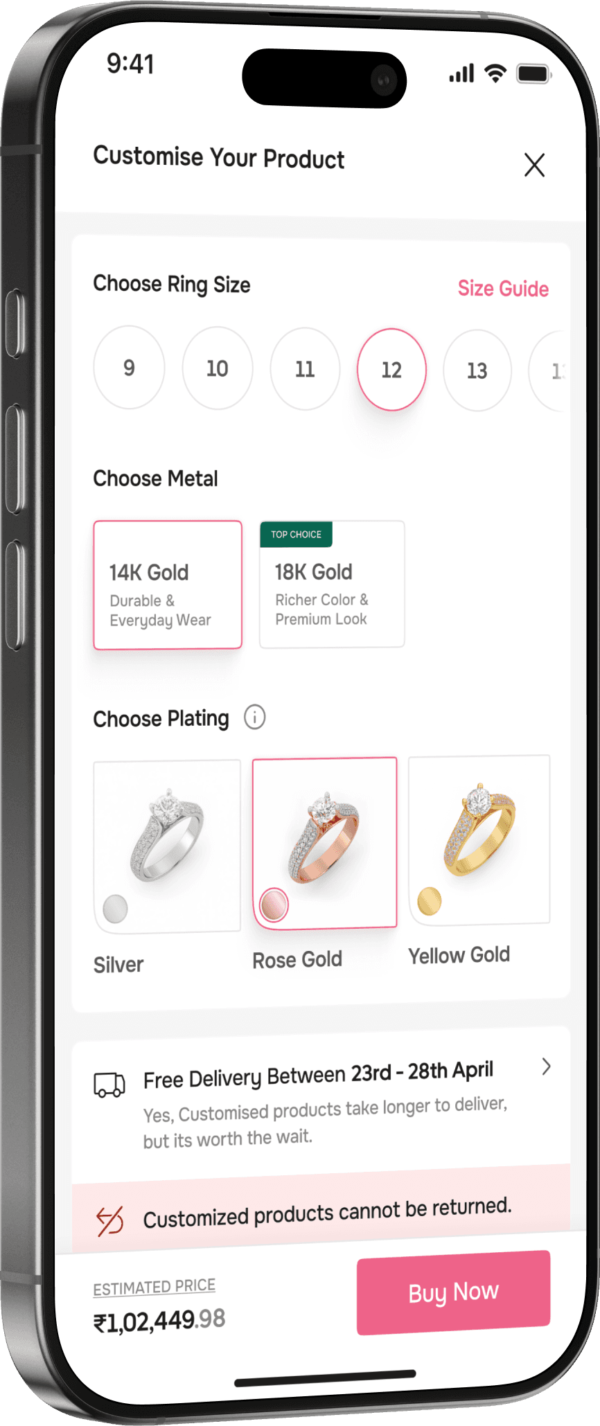
Bringing Clarity to Product Customization
The customization entry point now stands out visually stronger and clearly highlights the key product elements that can be modified.
Clear visual differentiation across sections, intentional cues like “Top Choice,” and focused supporting information make options easier to scan.

>>>>
Key policies like delivery and returns are contextually updated during customization.
Hence ensuring users always understand what applies to their selected configuration.


Some More Thoughtful Little Improvements
//////
>>>>>>